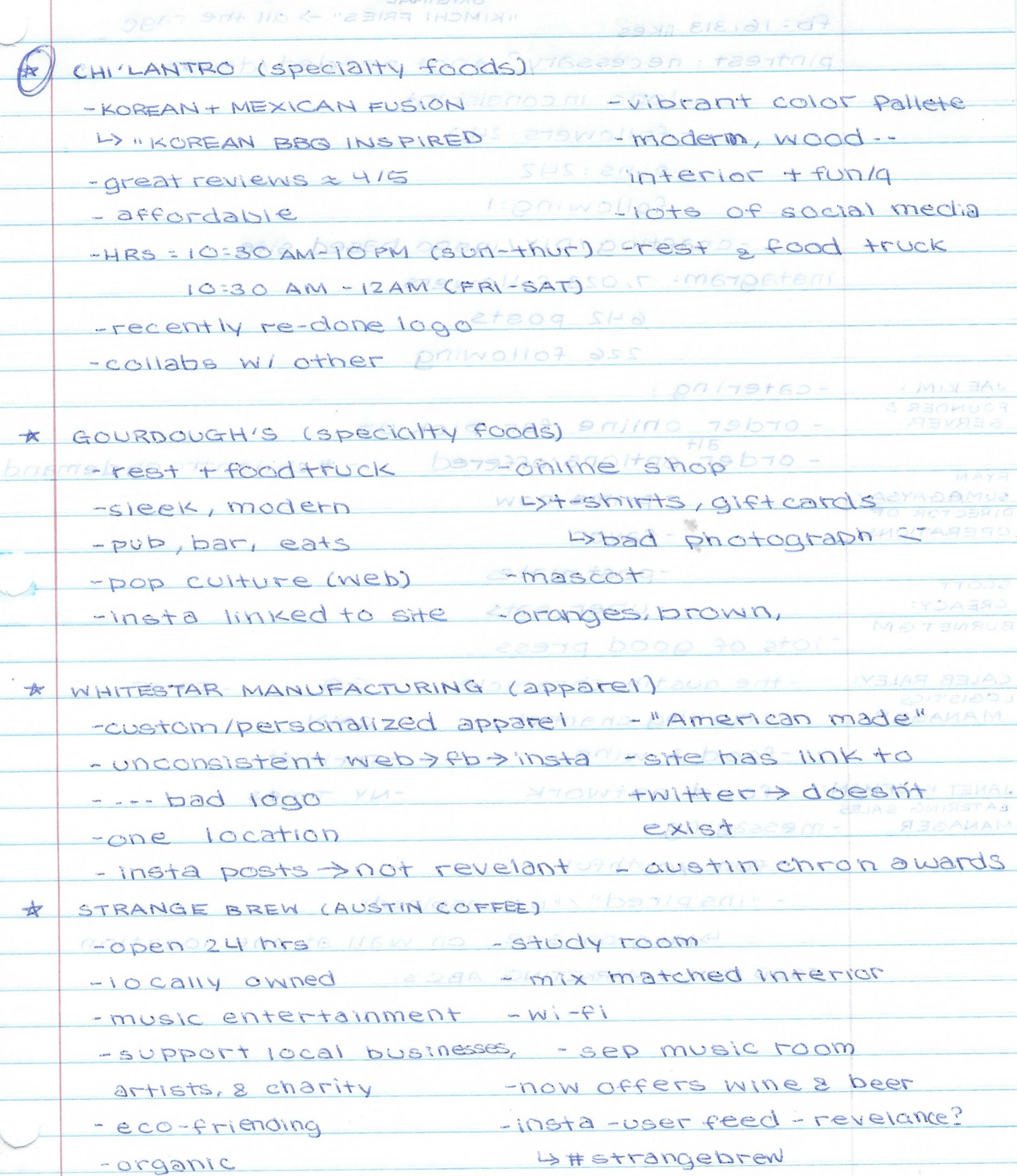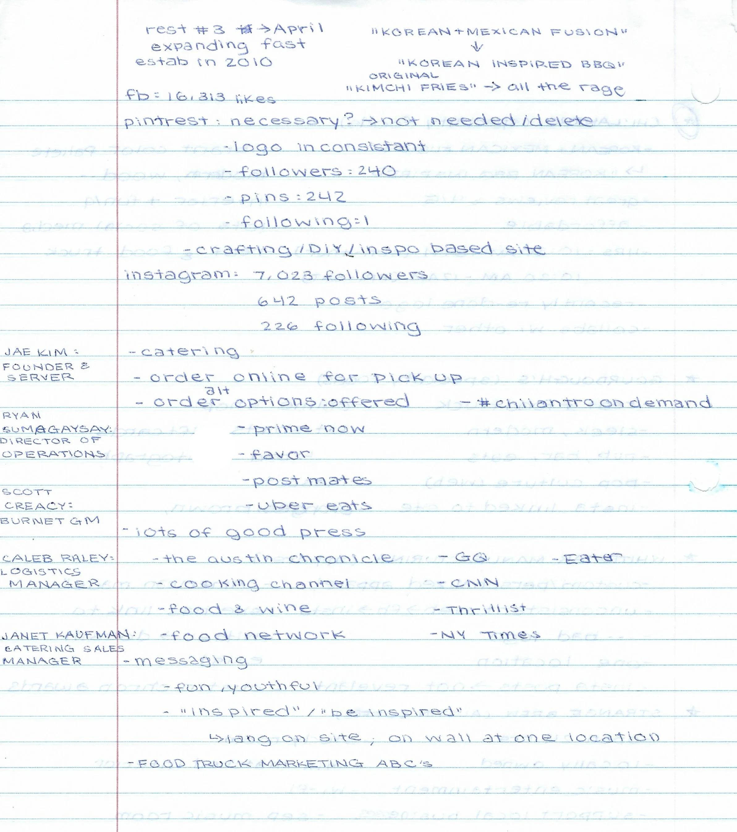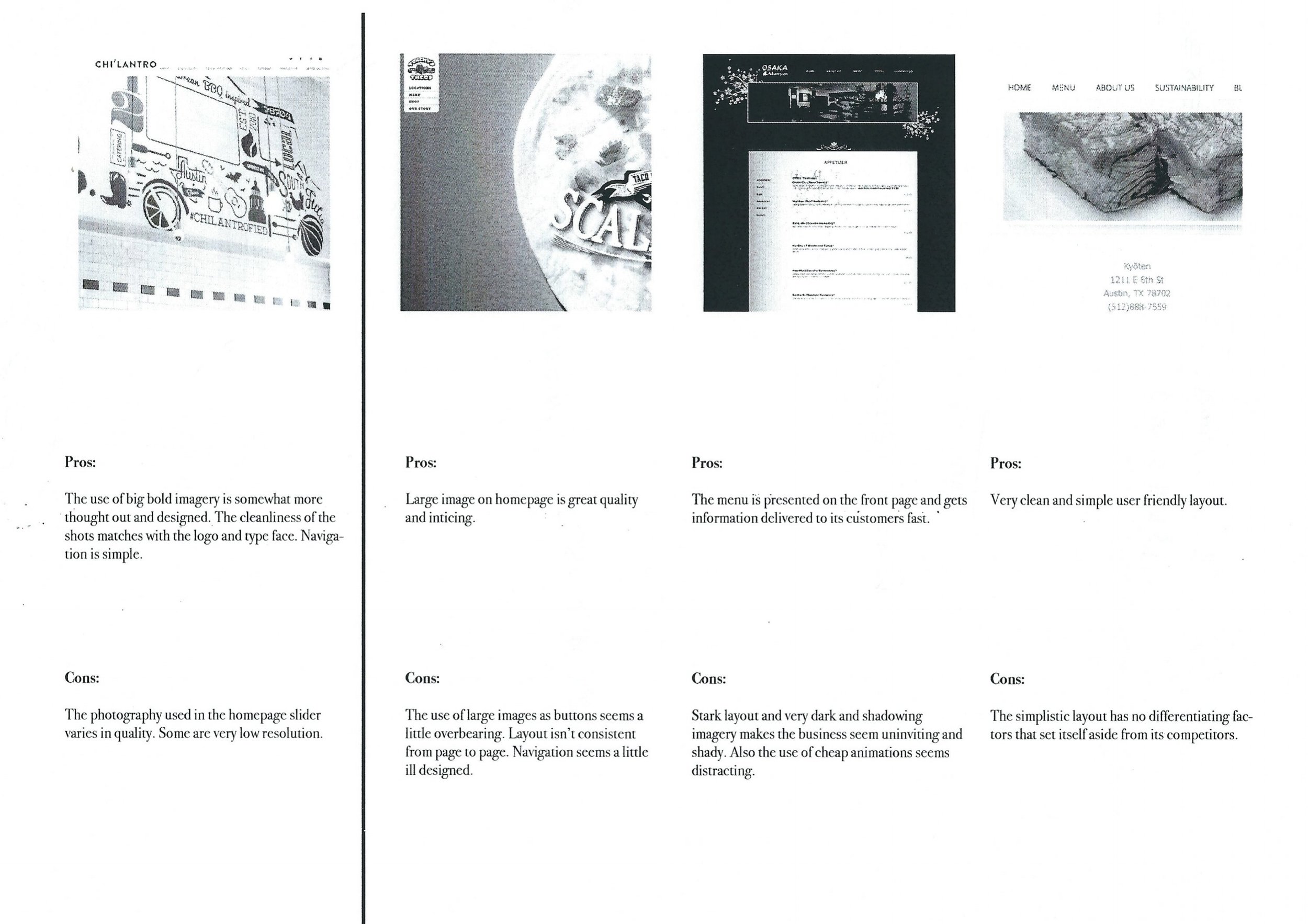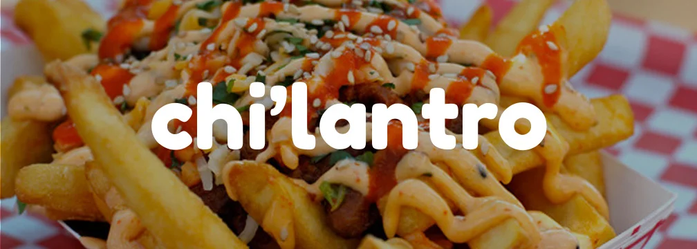

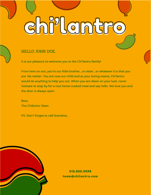
chi'lantro
BRANDING SYSTEM | ART DIRECTION
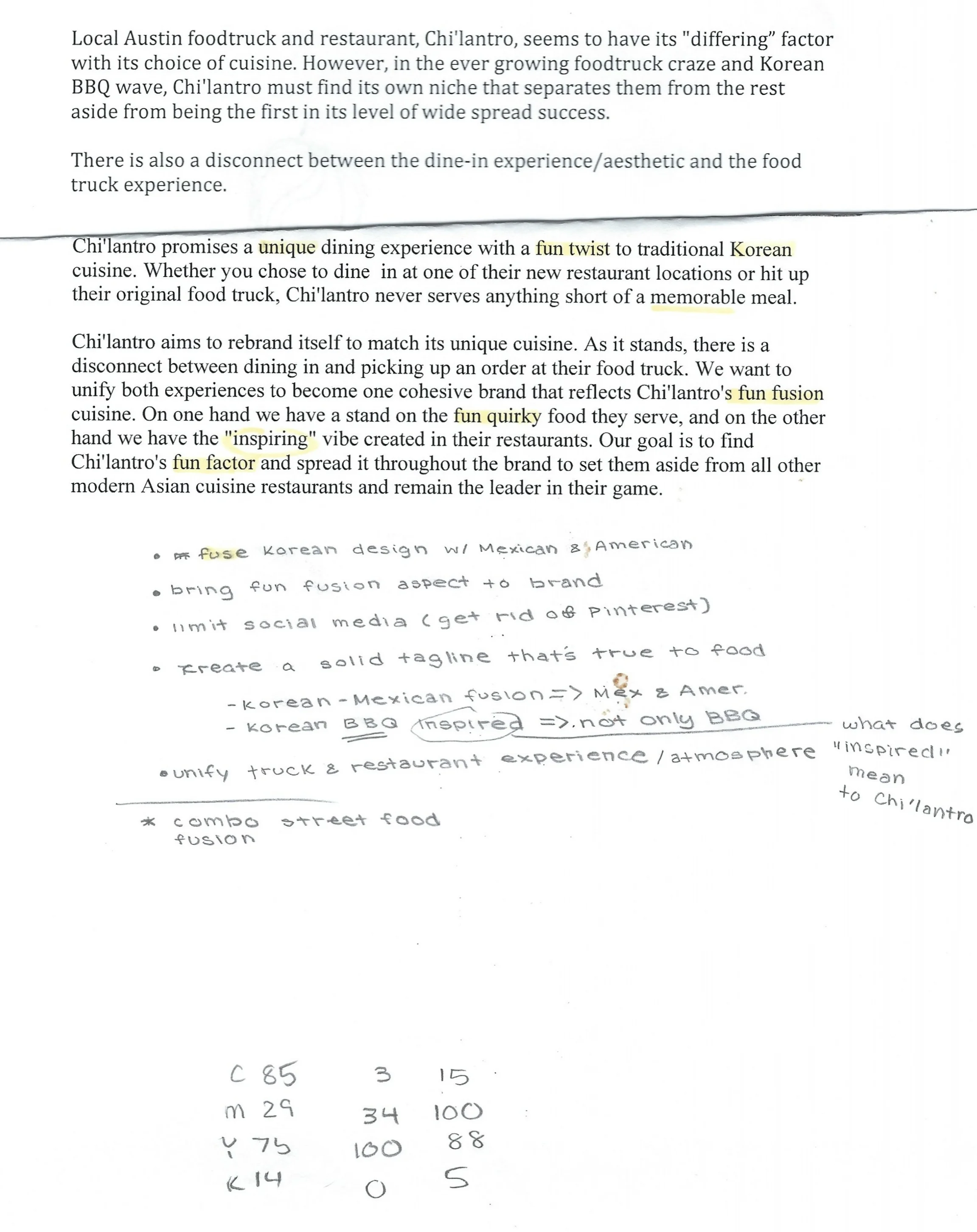
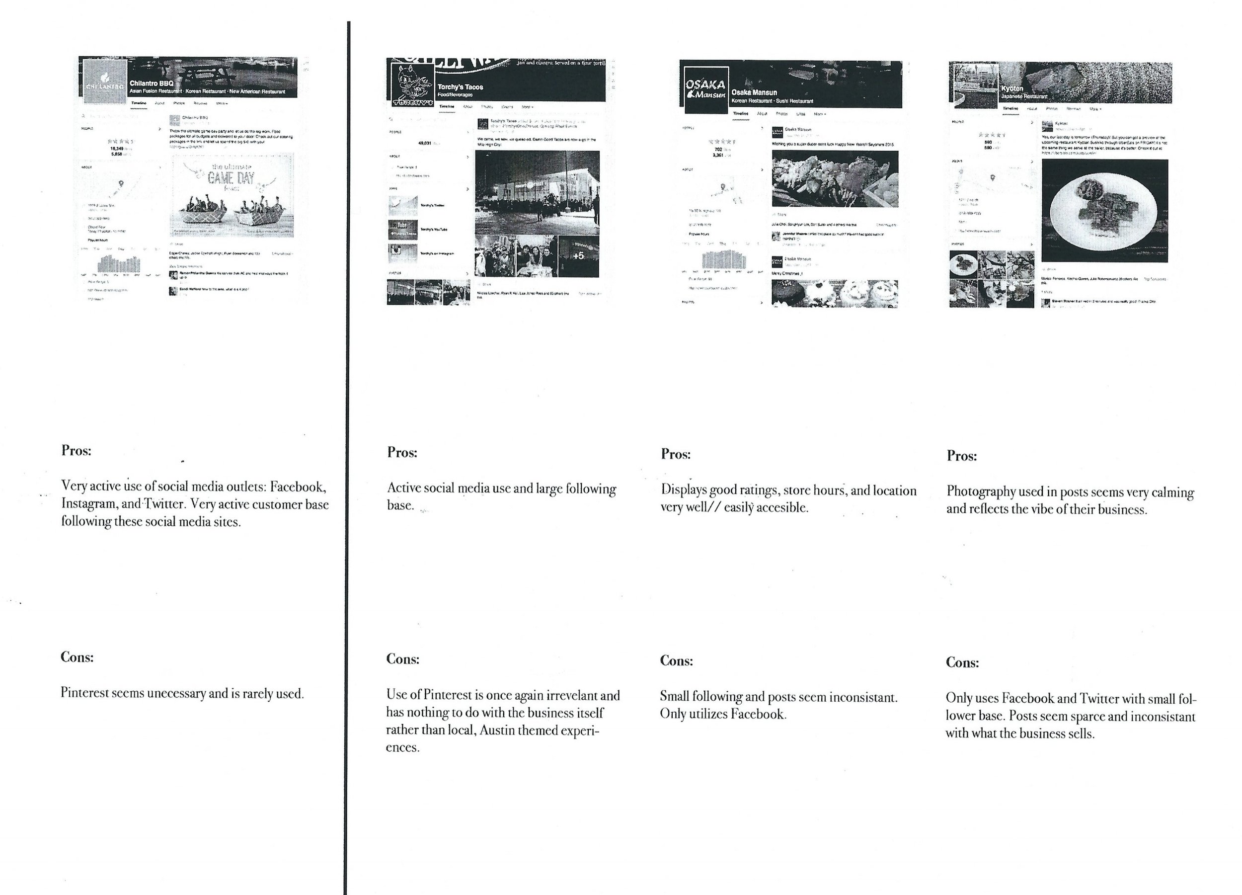
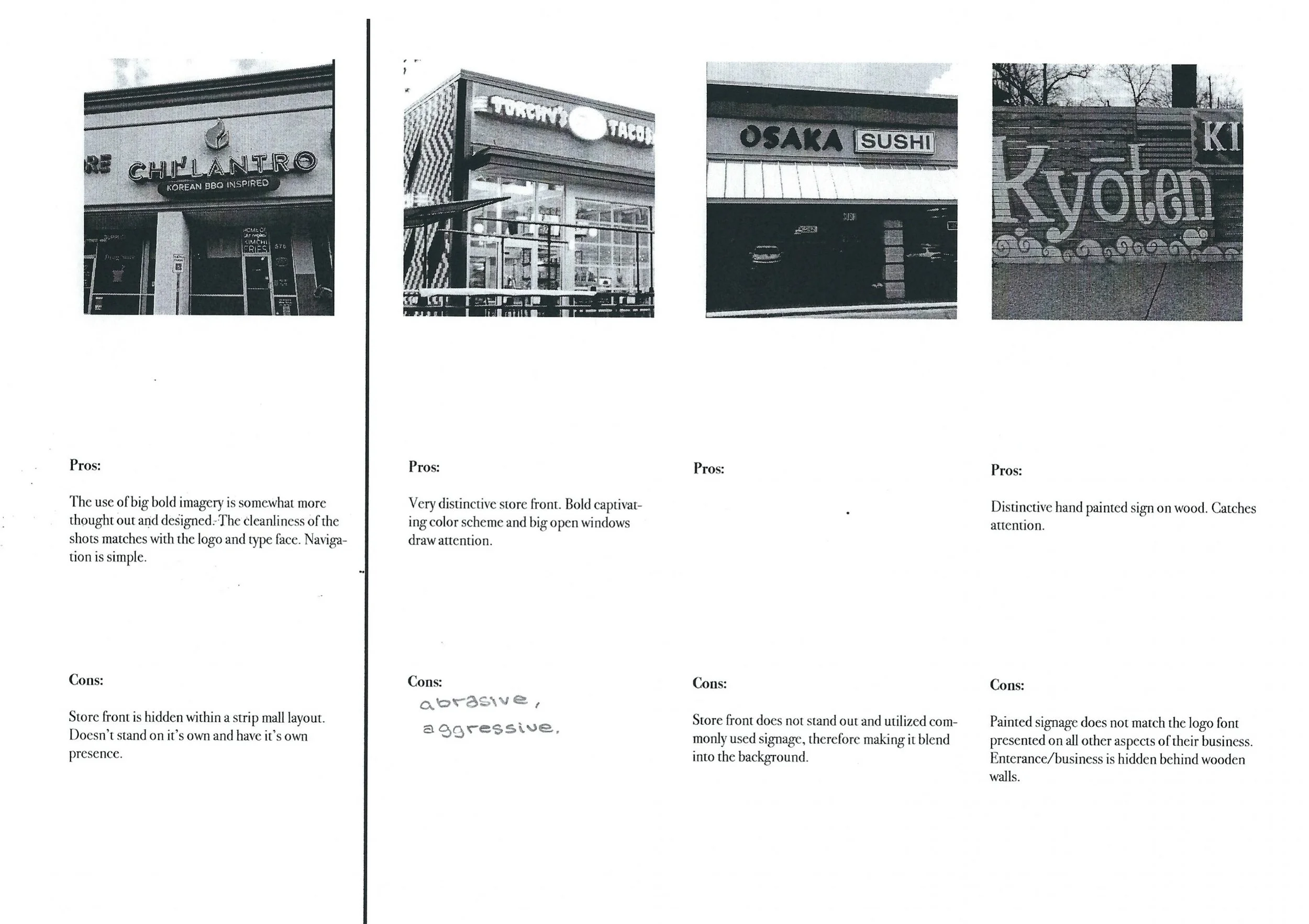
BRAND CHALLENGE
Chi'lantro promises a unique dining experience with a fun twist to traditional
Korean cuisine.
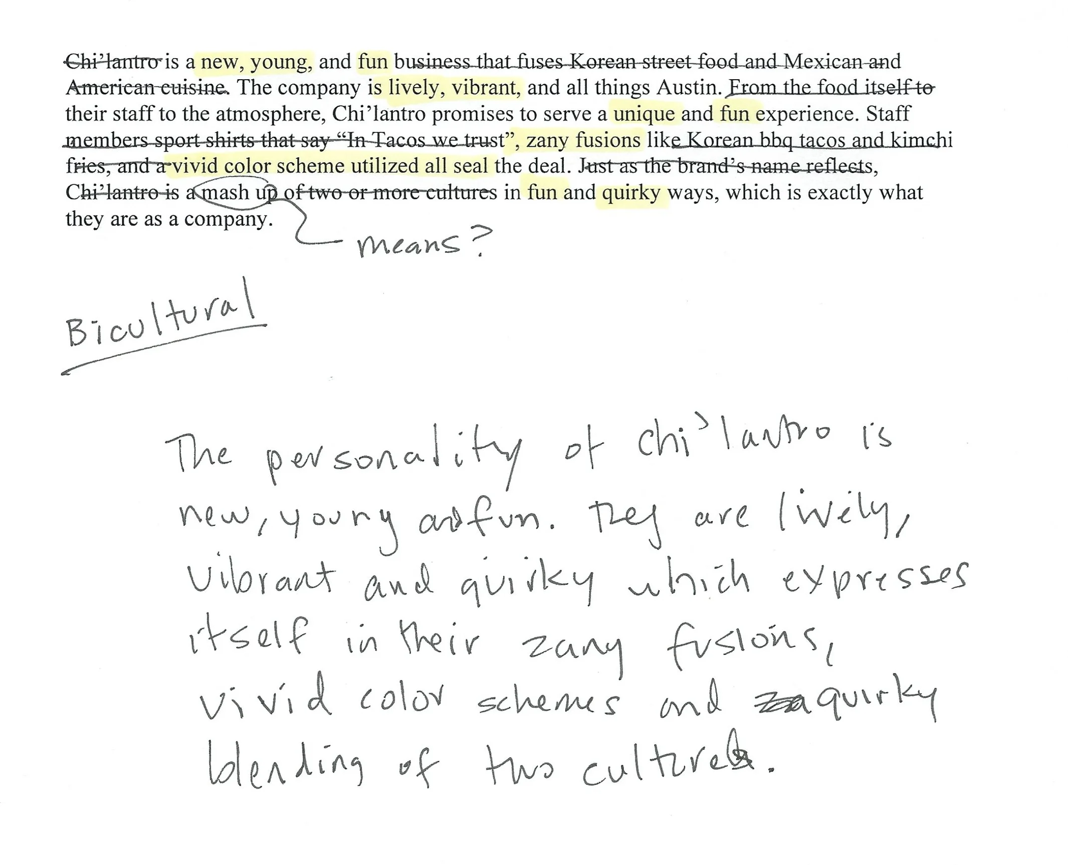
Chi'lantro is fresh, vibrant, quirky which is reflected through their zany fusions and mixing of two cultures.
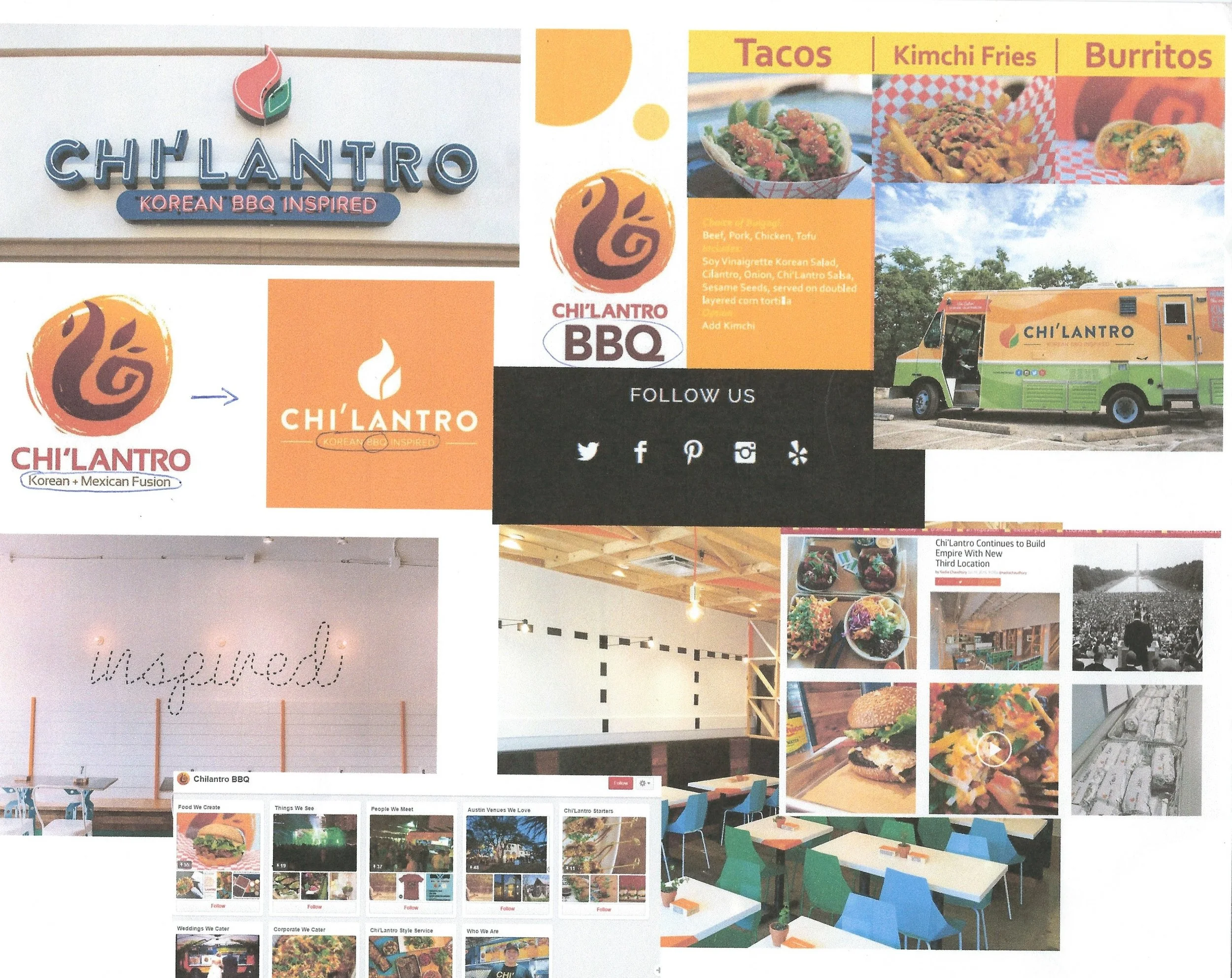
The current branding is heading in the right direction, but is lacking in personality and focus. Currently the type and restaurant interiors seem too streamline and modern which evokes a sterile environment opposed to a fun quintessentially Austin place to eat and socialize.
CREATIVE OBJECTIVE
This project called for a rebrand of Chi'lantro to bring out the brand's fresh and fun personality. In order to accomplish this, an entire new branding system had to be constructed that connected the Chi'lantro experience back to their original core values. By utilizing vibrant colors, an illustrative approach, and creating a new and fun logo, we gave Chi'lantro a the much needed face lift they needed.
We also emphasized their unique selling point – the fusion of both Korean and Mexican cultures – and focused in on it to create a unified experience and brand.
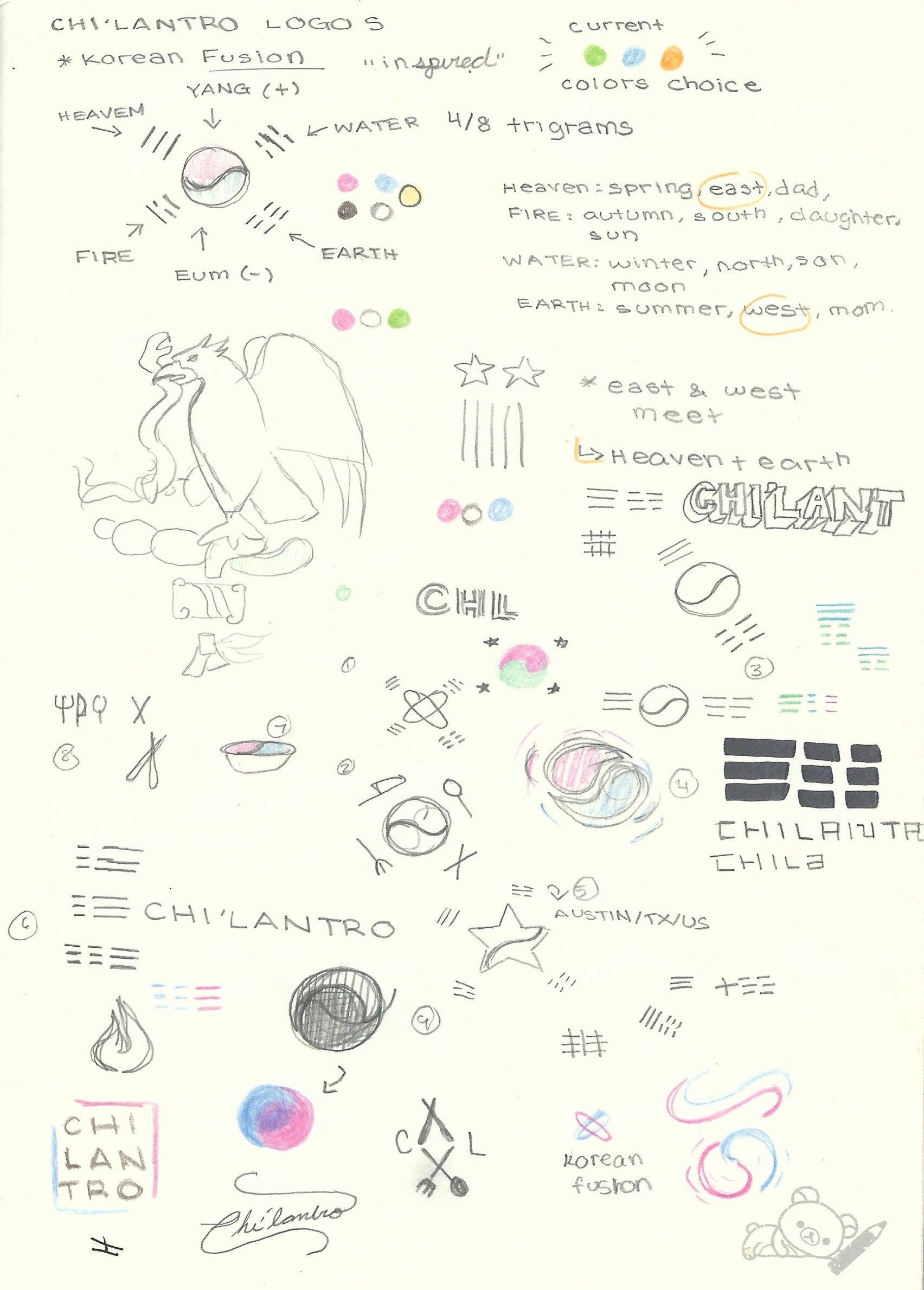
IDENTITY
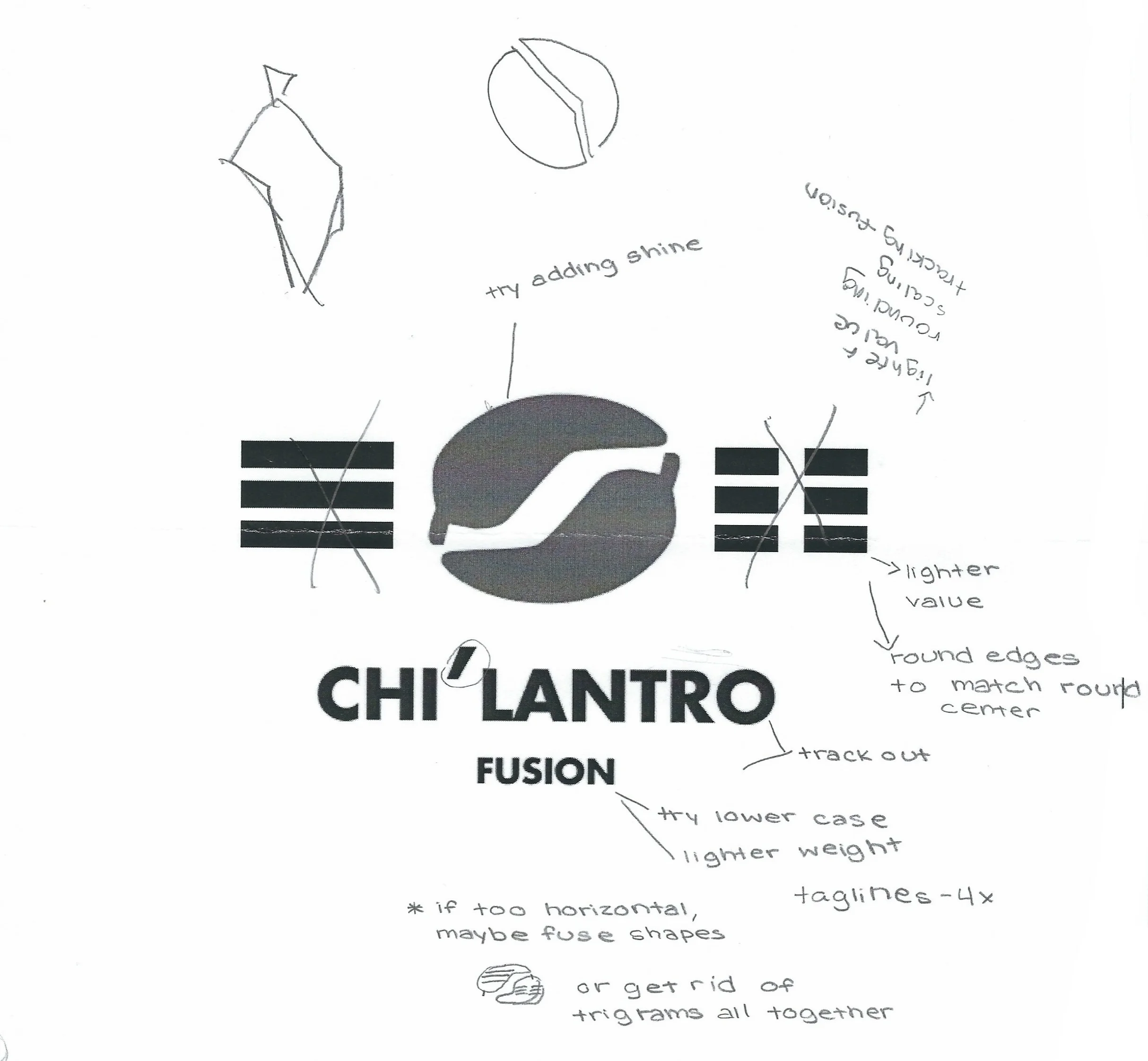
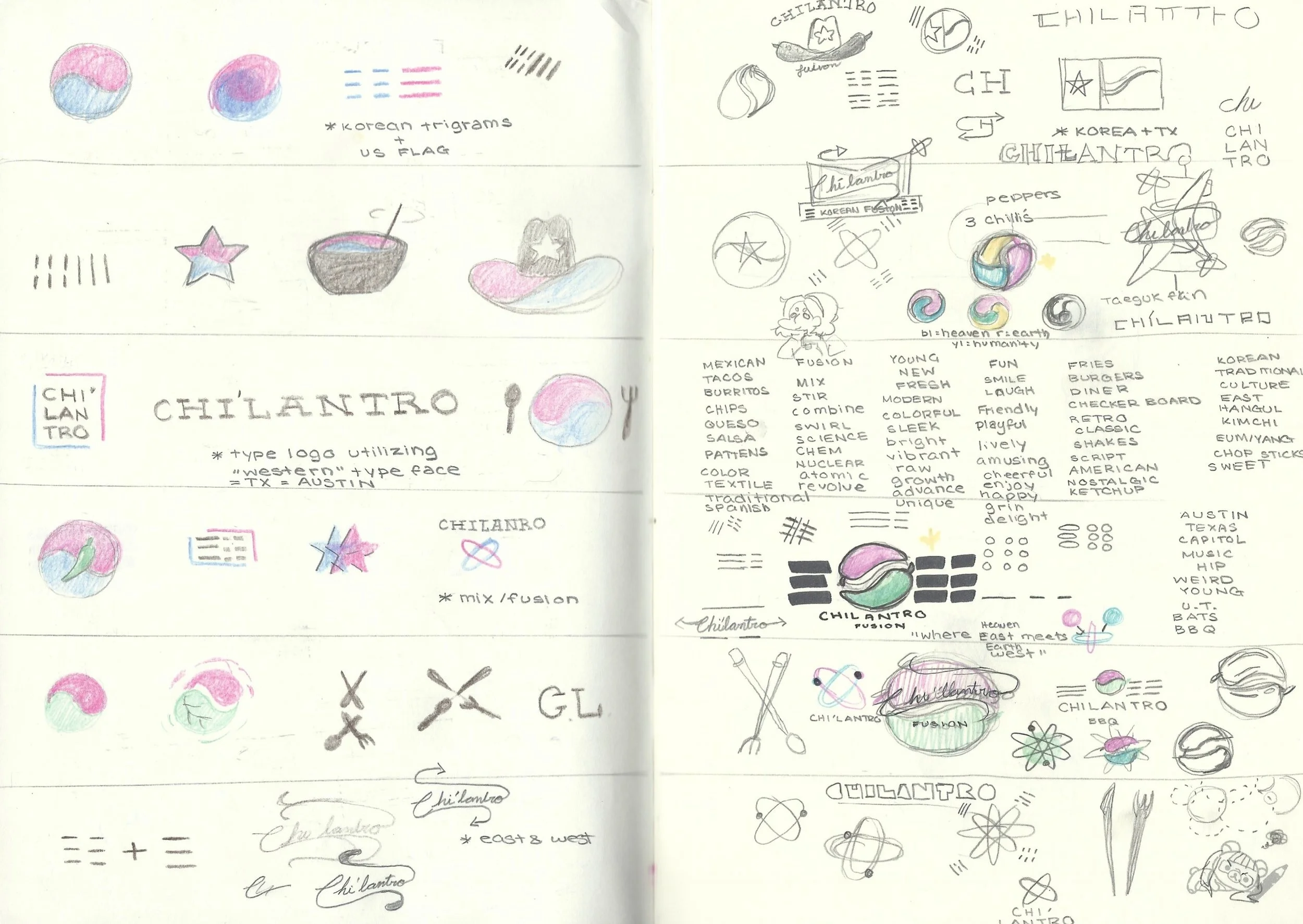
The first task I took on was creating a smart and conceptual logo that matched the company's desired personality. Ultimately, the final product drew inspiration from the South Korean flag, or Taegukgi, and it's iconic yin yang symbol. This represents the harmony of two separate forces. In this case, the harmony of two differing cultures – the East and West – became the brand's driving force. To completely illustrate the idea of the two cultures at play here, the two halves of the yin yang are actually illustrations of peppers to reflect the Mexican aspect of the brand. This illustrative and strong color pallete created the pathway to a more welcoming, fun loving, and hip Austin brand that Chi'lantro strived to be.
MISSION STATEMENT
Chi'lantro provides the perfect fusion of Korean and Mexican cuisine. We are where East meets West, where Heaven meets Earth, and where cultures collide into an amazing mouthwatering combination.
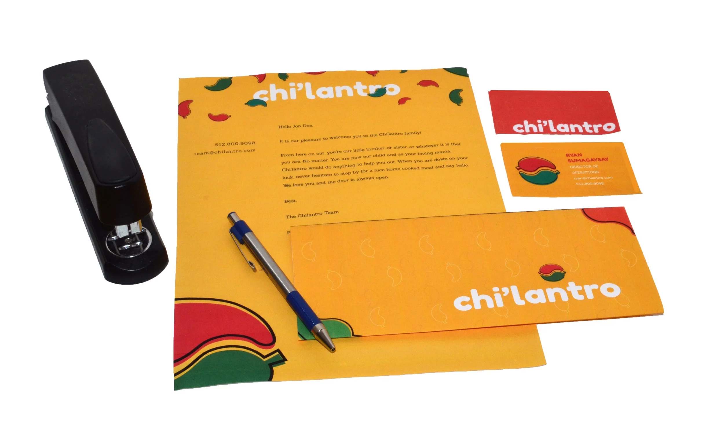
BRAND ASSETS
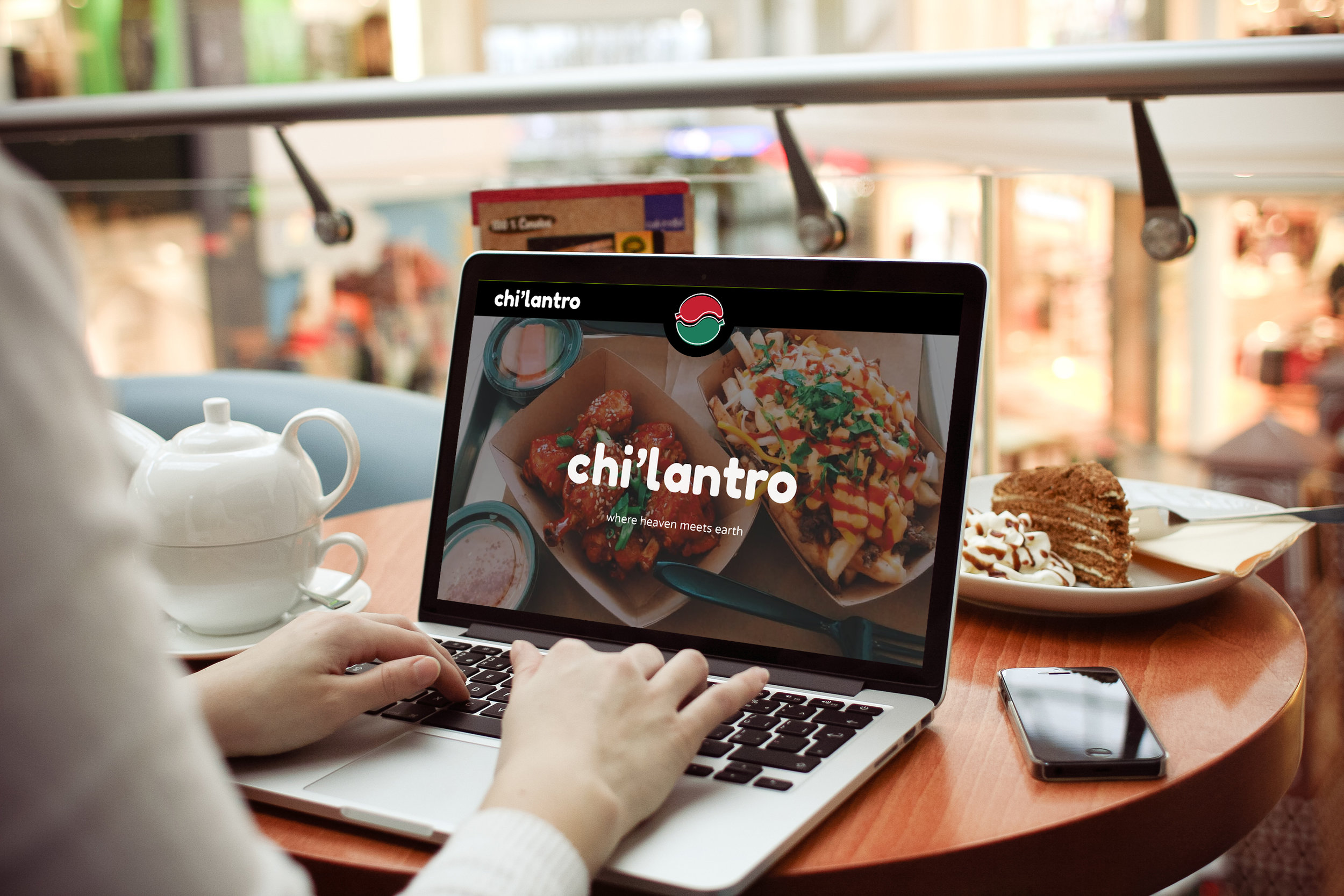
WEBSITE
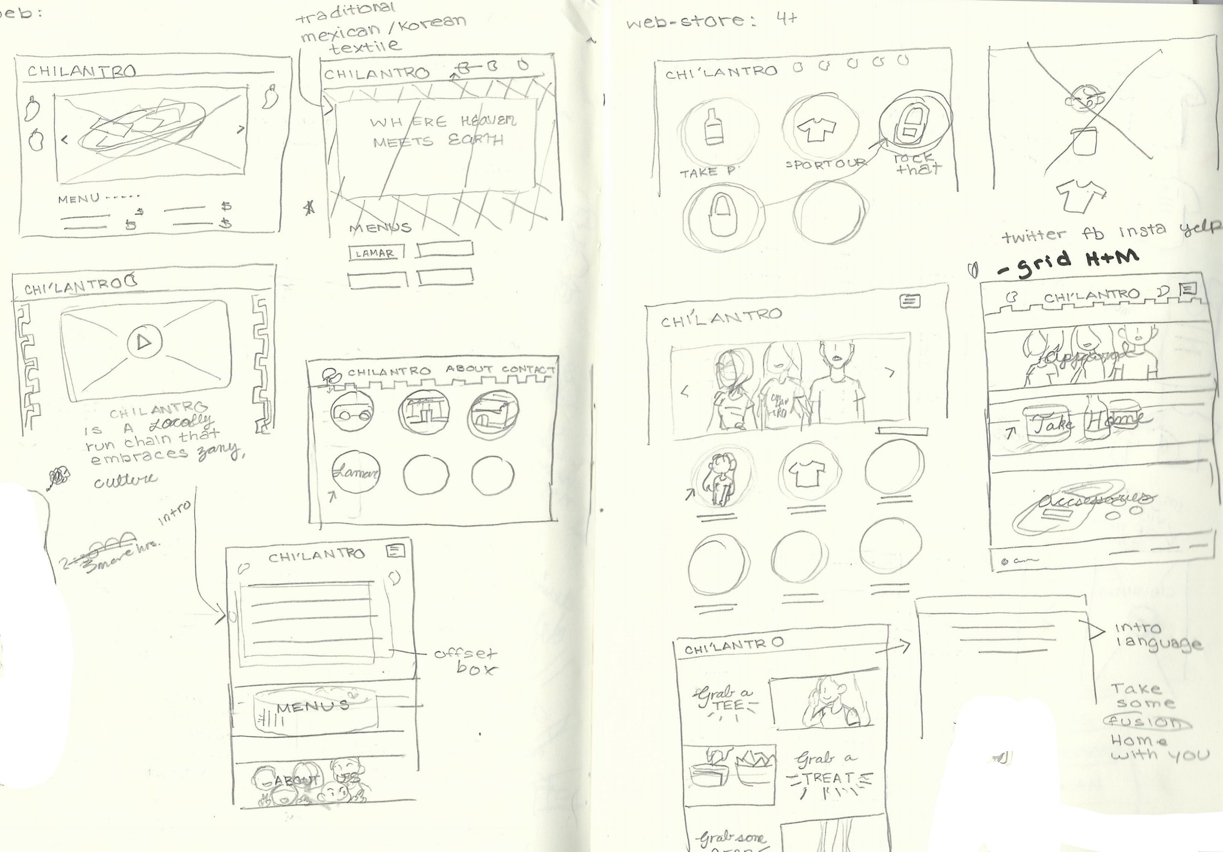
With the developed brand, the website reflected the brand's friendly look and feel. Ultimately, the site was decluttered and the focus was narrowed down to our customers' wants and needs when entering the site. The menu is front and center, various social media links and blogs that were inactive were removed, and thoughtful brand language was implemented. A new page for ordering online to make take our easier for customers was also added.
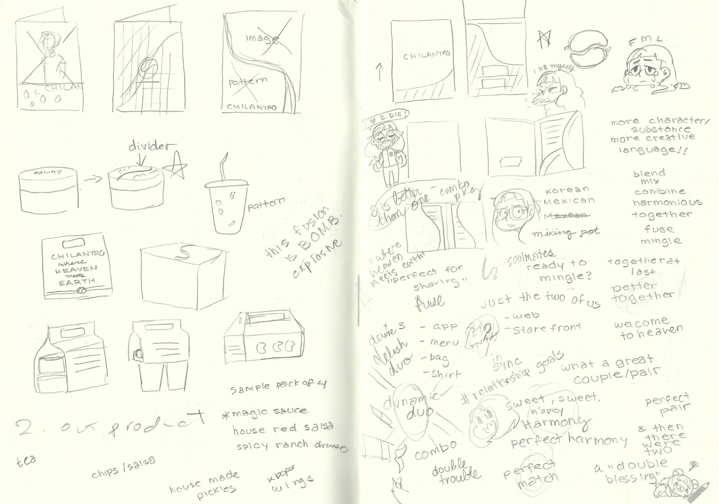
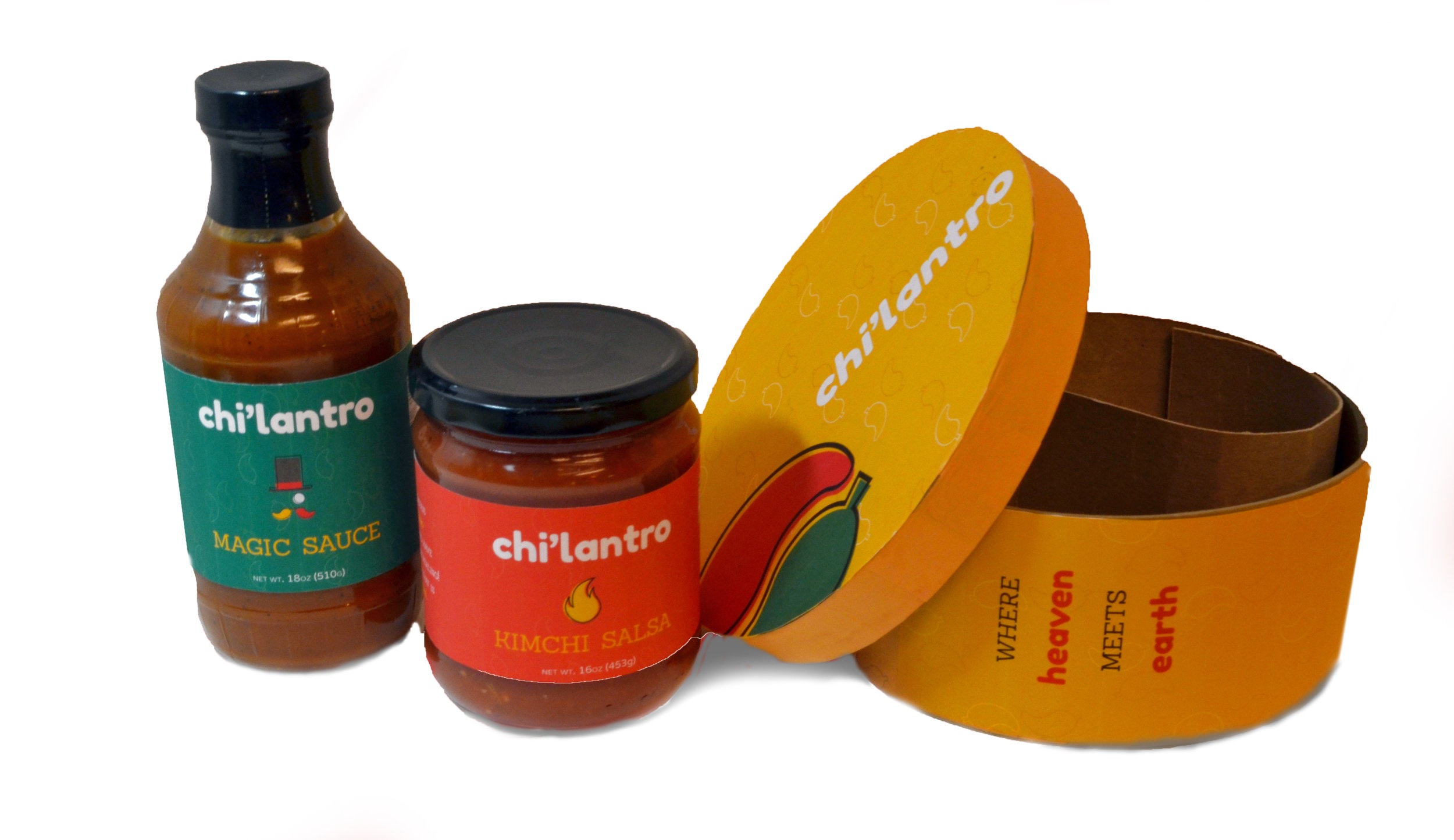
MECHANDISE | PRODUCTS
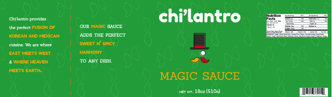
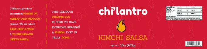
Sellable products were developed to expand the brand's potential revenue and market. These products included the bottling of Chi'lantro's Magic Sauce as well as a new line of Kimchi Salsa, both of which were to be sold in grocery stores. After interviewing several customers, we found that people were drawn to Chi'lantro's Magic Sauce and Kimchi Salsa that are made in shop.
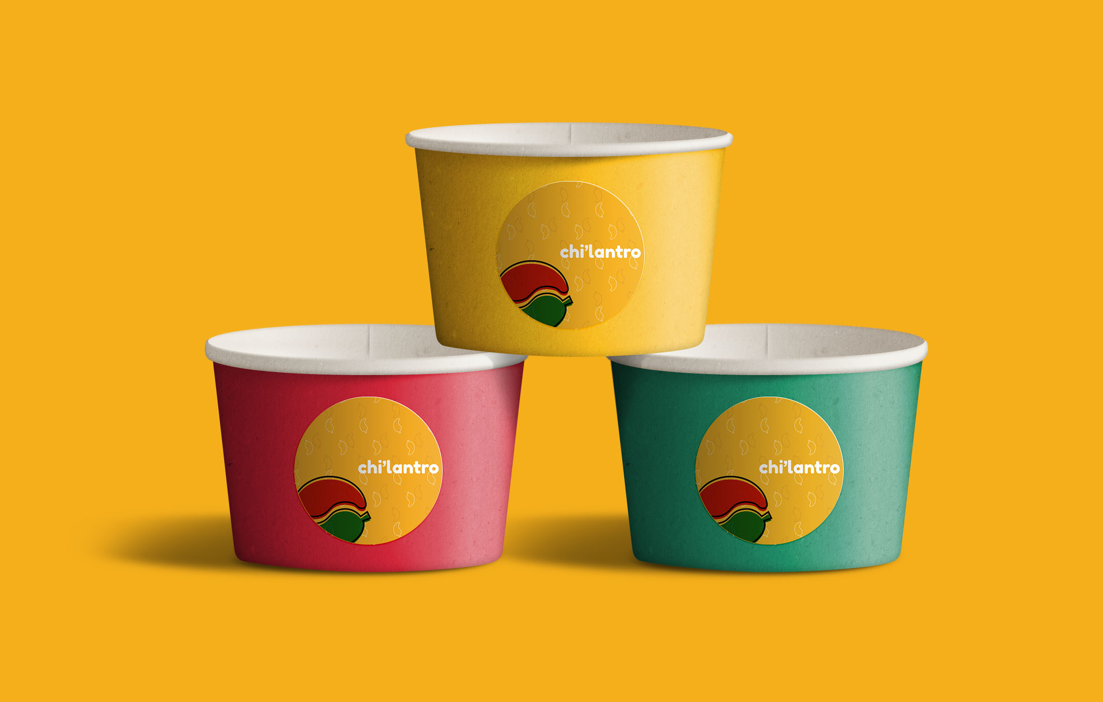
DINE IN ASSETS
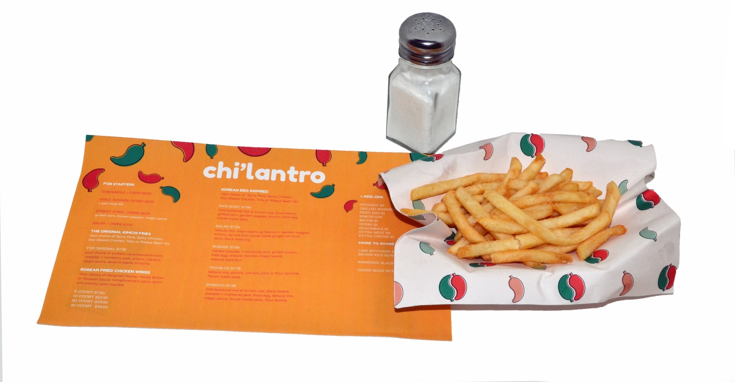
Currently, Chi'lantro utilizes simple unbranded cardboard trays, bowls, and disposable utensils for their establishment. After interviewing store managers and staff, it was determined that recyclable dinnerware was very important to them. With that in mind, we kept the environmentally friendly materials, but added a little fusion flavor to them. A new dine in and take out lunchbox was created to mimic the yin yang of the new logo, which would also be utilized to separate meals. This new lunchbox would be mad of completely cardboard which could easily be recycled. Along with this, a simple paper liner for Chi'lantro's appetizers and Kimchi Fries was developed to add a cohesiveness to every aspect of the dine in experience. A brand was now prominent when you saw someone eating outside of Chi'lantro whereas before the generic materials used could have been any food truck or restaurant.
PROCESS